Viewi UI: the components behind Urlicer's folders
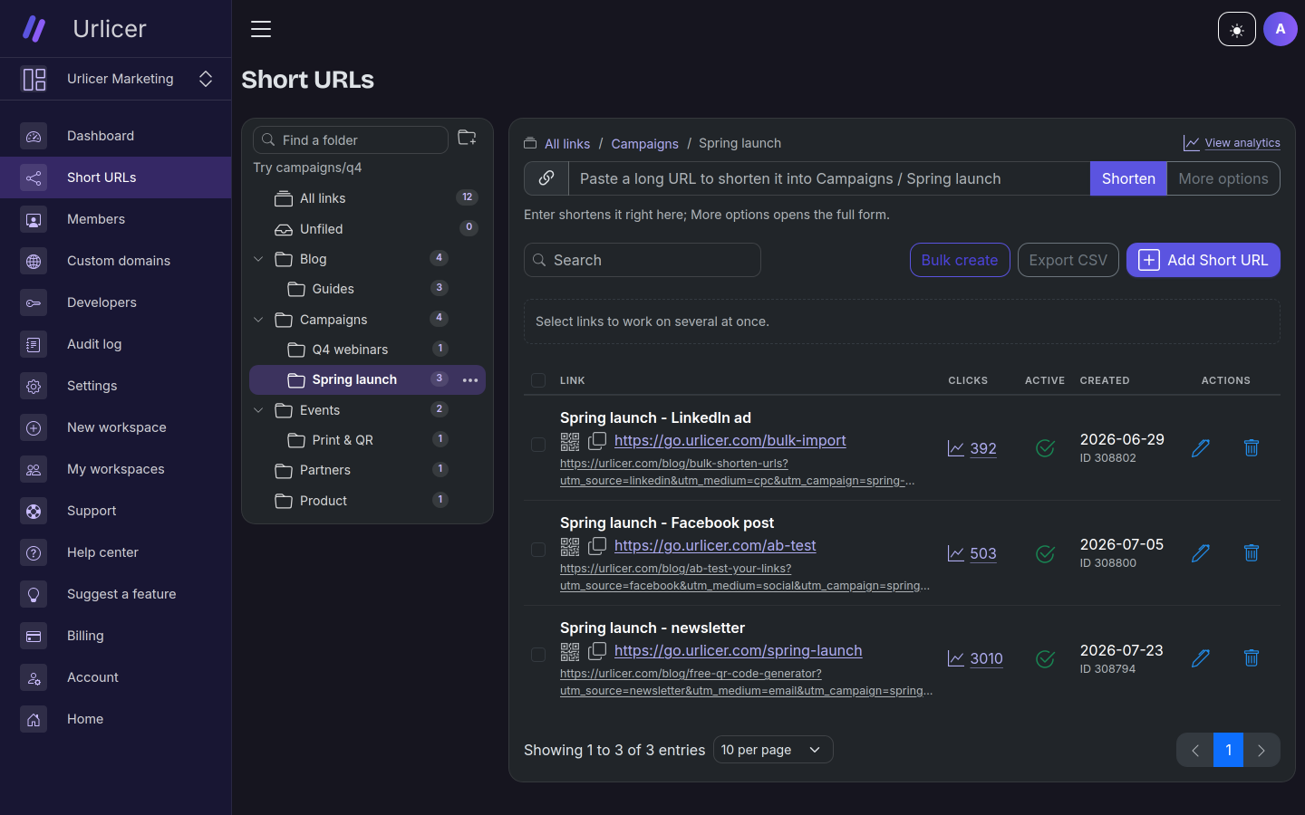
Folders went live in Urlicer on 23 September. The screen above is where people use them, and most of what's on it is Viewi UI components written in the two weeks before that. The tree, the menu on a folder row, the search box above it, the breadcrumb, the checkboxes and the page size selector all came from this one page.
They went into Viewi UI rather than the app, so the next app with a list of things in groups can use them as they are. Here they are in the order you meet them on the screen.
The tree
TreeView takes a flat list of TreeNode objects in tree
order. Each node knows its depth and its parent's key. That's the whole data model. It maps
straight onto a table with a ParentId column, and there are no nested arrays to build.
$this->nodes = [
    // key, label, depth, parentKey, icon, badge
    new TreeNode('docs', 'Documents', 1, null, 'bi-folder', '3'),
    new TreeNode('reports', 'Reports', 2, 'docs', 'bi-folder', '2'),
    new TreeNode('q1', 'Q1.pdf', 3, 'reports', 'bi-file-earmark'),
];
It doesn't change selected on its own. It emits select with a key and
your component decides what that means. In Urlicer, selecting a folder loads its links. That's
also why "All links" and "Unfiled" at the top are just two more nodes, with keys -1 and 0. The
arrow keys walk from them into the folders without any special case.
The keyboard works the way a file tree does: one Tab stop for the whole tree, arrows up and
down between visible rows, right to open or go to the first child, left to close or go to the
parent, Home and End. A small tree starts open. Past collapseOver nodes it starts
closed, and whatever the user opens or closes stays that way when the list reloads.
A menu on every row
Each folder has a ⋯ button: View analytics, Folder settings, New subfolder, Rename,
Move to and Delete. That's
DropdownMenu, placed in the tree's actions slot:
<TreeView items="$nodes" selected="{selectedKey()}" label="Folders" (select)="select">
    <slotContent name="actions" data="$node">
        <DropdownMenu items="$menuItems" label="{'Actions for ' . $node->label}"
            (select)="onFolderAction($node->key, $event)" />
    </slotContent>
</TreeView>
The slot sits beside the row's button, not inside it, because a button inside a button isn't valid HTML. The menu stops its click from bubbling, so opening it doesn't select the folder, and only one menu is open on the page at a time.
Rename happens in place. The tree has an edit slot and an editingKey
property. Set the key and that row turns into whatever you put in the slot:
<slotContent name="edit" data="$node">
    <input class="form-control form-control-sm" model="$folderName"
        (keydown.enter)="save" (keydown.escape)="cancelEdit" />
</slotContent>
The (keydown.enter) part is one of the event
modifiers that arrived in Viewi 2.8.2 the same week.
Finding a folder
Above the tree is SearchInput: a search field with a clear
button that also clears on Escape. It has a debounce property for when every keystroke
costs a request. Here the tree is already in memory, so it's set to 0 and filters as you type.
While a search is on, the tree switches to flat and shows the matches as a plain list.
They match on the full path, so "campaigns/q4" finds Q4 webinars inside Campaigns.
Moving things
There are two ways to move links into a folder. Both end in the same request, and both offer Undo.
The first is "Move to..." on selected links, which opens a
TreePicker. It's a button that opens a panel with a search box and a
TreeView. The same picker moves a folder, with the folder itself and everything under it passed
in disabledKeys. They're listed, so you can see where you are, but you can't pick
them.
<TreePicker items="$moveNodes" selected="$moveParentKey" disabledKeys="$moveDisabled"
    label="Move into" icon="bi-folder" searchPlaceholder="Find a folder" (select)="onMoveTarget" />
The second is drag and drop. The DataTable has draggableRows, TreeView has
draggableKeys, dropEnabled and dropDisabledKeys. So you can
drag links onto a folder, or a folder onto another folder. Neither component moves anything
itself. The table emits rowDragStart with the row's item, the tree emits
drop with the key under the pointer, and the page connects the two. A row that can't
take the drop shows the browser's no-drop cursor.
Firefox won't start a drag unless the dragstart handler calls
setData() on the event's dataTransfer. Both components call it, so you
don't have to.
After a move, the page shows a notification with an Undo button:
$this->messages->action('success', 'Moved 3 links to Campaigns / Q4.', 'Undo',
    fn() => $this->undoMove($result), 10000);
action() is new on the alert service. The callback runs only if the button is
pressed. If the message times out or is closed, nothing happens. There's no move history on the
server: the notification holds everything Undo needs.
The list
The links themselves are a DataTable, which picked up most of the changes in this release. The list above uses nearly all of them at once:
<DataTable stacked selectable sticky draggableRows="$canMove"
    (selectionChange)="onSelectionChange" (rowDragStart)="onRowDragStart"
    selectionHint="Select links to work on several at once."
    emptyIcon="bi-link-45deg" emptyTitle="No links yet"
    emptyText="Shorten your first URL to start sharing it.">
- selectable adds a checkbox to each row and a selection bar above the table. The bar shows a hint while nothing is selected, and the count and your buttons once something is. It keeps its height in both states, so selecting the first row doesn't push the table down.
- sticky keeps the column titles at the top of the screen while you scroll a long page, with the toolbar, the selection bar and the head slot above them. It works from 920px up.
- A page size selector next to the paging, the "10 per page" in the screenshot.
- A head slot above the rows. Urlicer puts the Breadcrumb there: All links / Campaigns / Spring launch, each part clickable. It's drawn even on All links. When it was hidden there, switching folders moved the whole list up by a line.
- Empty states. An empty table says why it's empty. "No links yet" with a create button is one case. A search that matched nothing is another, and it gets "No matches" with a Clear search button. The same EmptyState component works on its own too: Urlicer uses it on six other pages.
On a phone
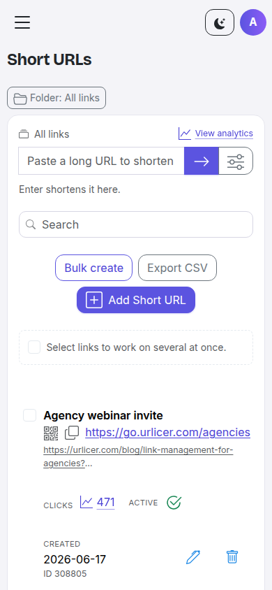
stacked on.A table with six columns doesn't fit on a phone. By default the DataTable now scrolls sideways
inside its own box, so the page doesn't get wider. With stacked, below 920px each
row becomes a card and every cell gets its column title as a small label. You mark the main cell
with table-stacked-main, and a column you don't need between 920px and 1200px with
table-col-wide-only. Selection works there too: the checkbox moves into the card.
Details and a live example: Small screens.
Smaller additions
- CopyButton copies a value and shows on the button whether it worked. Urlicer has it in ten templates, next to every short link and API key.
- DateRangePicker: a button that opens a month grid, pick a start and an end, then Apply. Urlicer uses it on the analytics pages and both dashboards.
- SelectInput works from the keyboard now and can take extra options.
Getting it
Everything above is in Viewi UI 1.3.3:
composer update viewi/ui
Every component has a page with a live example in the Viewi UI docs. The examples run on this site, so you can try the keyboard and drag and drop there before writing any code.